Simple Harmony, Striking Mood
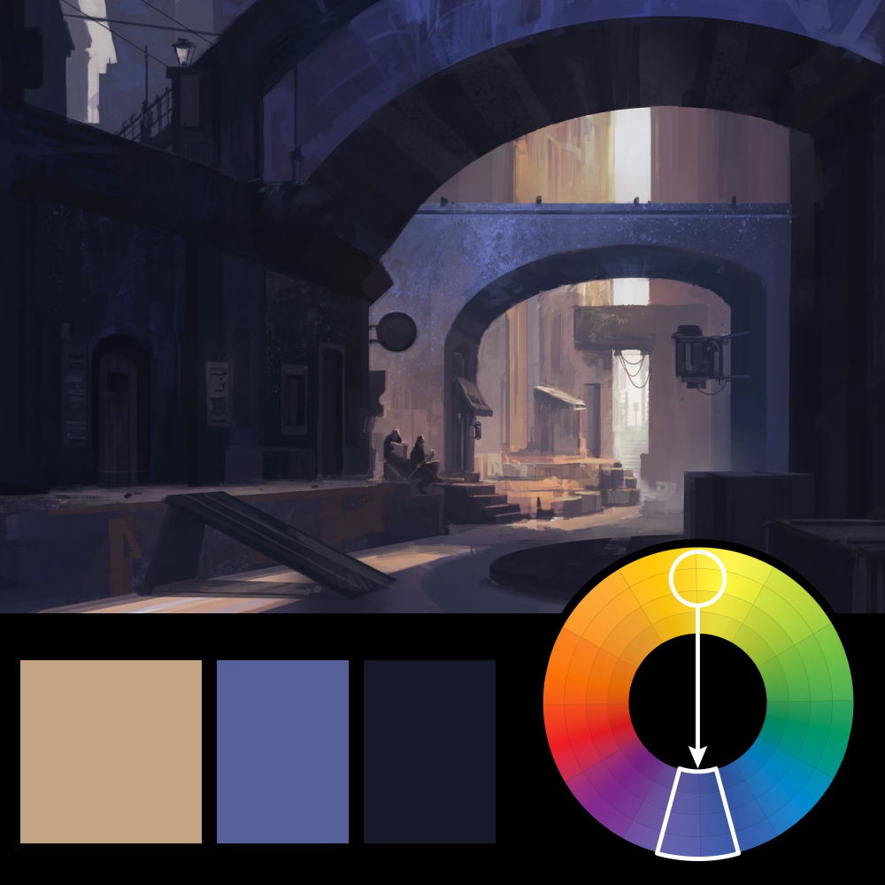
Artwork: Arch Alley by Arch Alley (ArtStation)
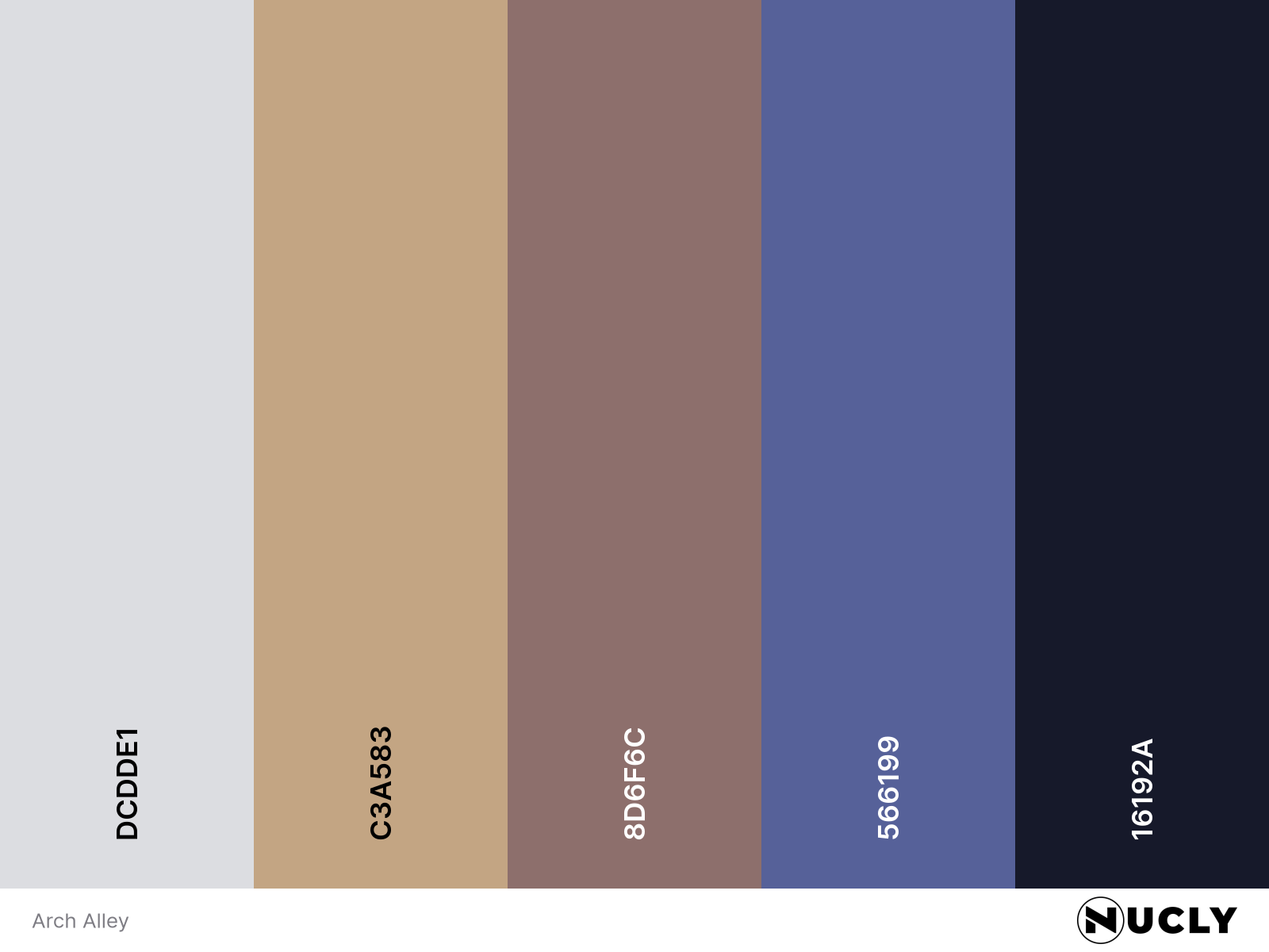
Color Harmony: Complementary
Key Color: Warm Beige
Link to Palette: Colors on coolors.co
This week’s featured artwork is Arch Alley, a moody environment study that balances dramatic shapes with painterly atmosphere. The palette is a straightforward complementary harmony: warm beige plays against cool purples and deep navy shadows, giving the entire piece a grounded, cinematic weight.
The composition leans on strong architectural silhouettes—arches, staircases, scaffolding—creating rhythm and structure. Within that, the small figures tucked into the scene provide scale and human contrast, pulling the viewer deeper into the world. It's a great example of how color and shape can do a lot of narrative lifting with very little noise.