Horror That Trusts Restraint
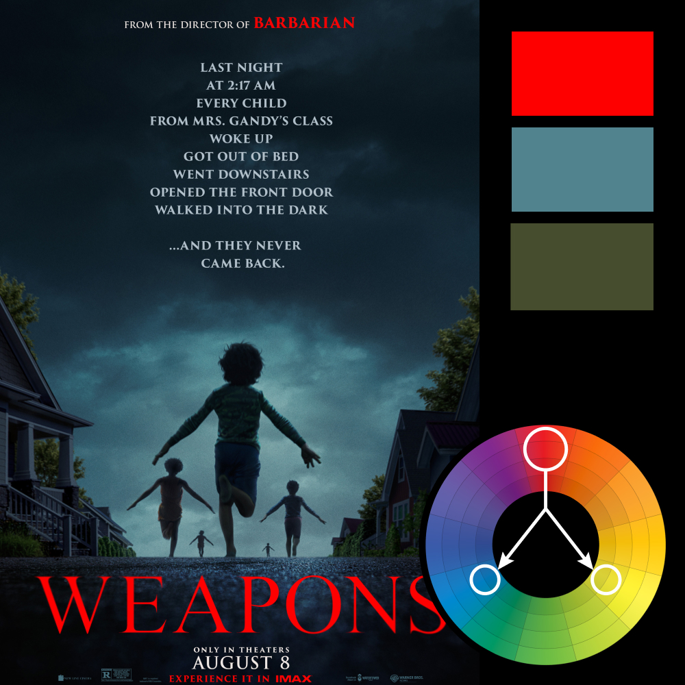
Artwork: Weapons (2025 Poster)
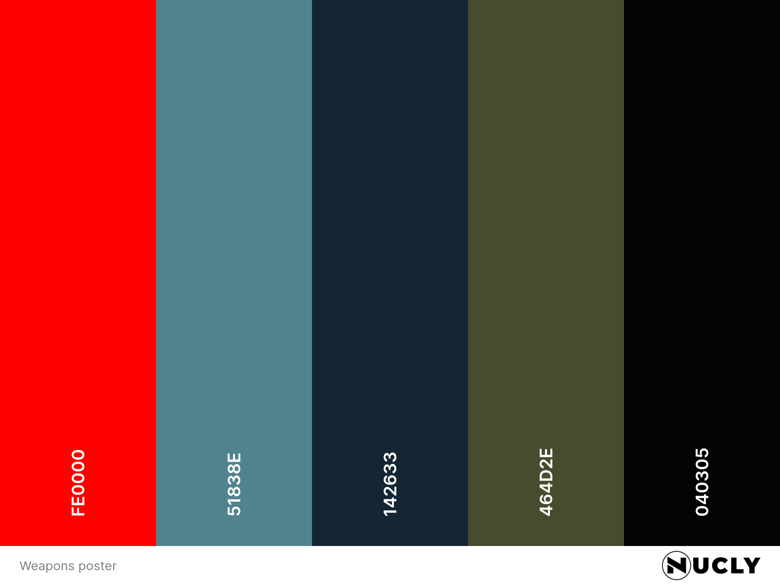
Color Harmony: Triadic
Key Color: Saturated Red
Link to Palette: Colors on coolors.co
A restrained triad drives this poster: a saturated red used sparingly, surrounded by desaturated blue and a muddy yellow-green that separates the trees from the sky.
The red appears in tiny doses — the title and the Barbarian credit — which makes it feel intentional, not decorative. The blue-teal field carries the mood. The dark yellow-green prevents the whole frame from collapsing into monochrome. It’s disciplined.
The campaign matched that restraint. The poster and trailers sold only the premise. No faces. No stars. No reveals. Just the hook. My two small gripes are typographic. The mix of Trajan and what appears to be Perpetua Titling feels redundant. Pick one classical serif and commit. More importantly, the block of all-caps narrative copy asks us to read too much, too loudly. A tighter sentence in upper/lower would preserve the tone while improving legibility.
Still — an excellent poster. The impawards win makes sense. The film itself? Not for everyone. But as a horror fan, I enjoyed it.