Exploring the Seas of Color

Artwork: Intrepid Ocean Explorer
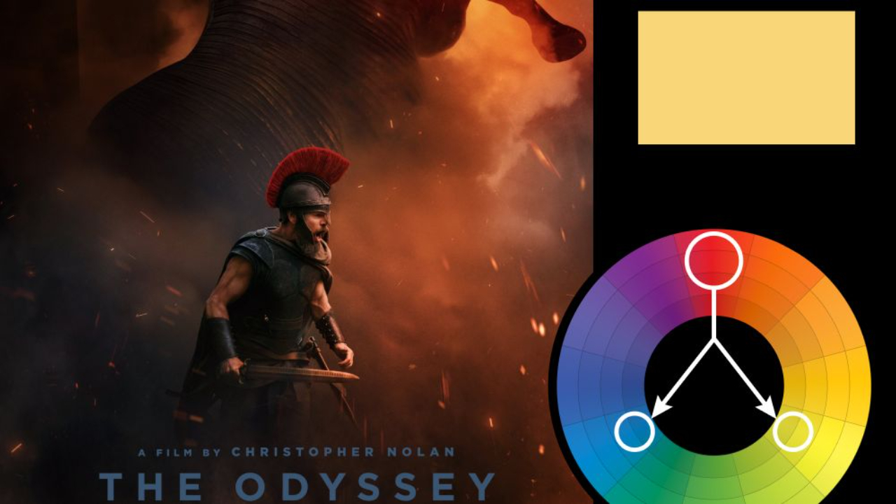
Color Harmony: Triadic
Key Color: Red
Link to Palette: Colors on Coolors.co
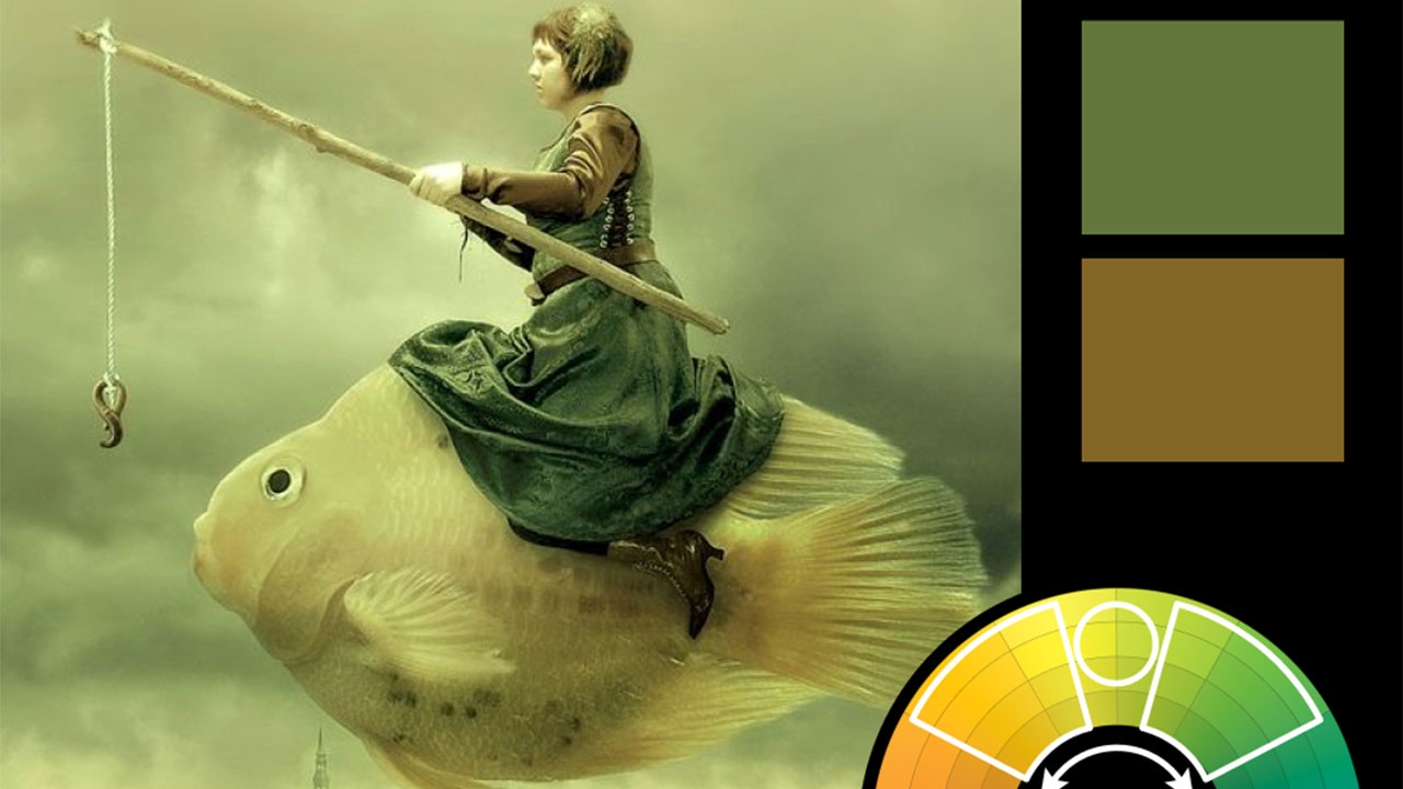
This week's image is the composite for my upcoming course—Intrepid Ocean Explorer—which will be available to Academy Members on Monday and released to the public on Friday. The color harmony follows a triadic balance, with bold reds taking center stage. In triadic harmonies, you can create a more balanced composition by toning down your secondary colors and letting the key color remain saturated. Here, both the blue and yellow tones are muted, allowing the red tones in the scarf and suitcase to pop without overwhelming the scene.
The overall effect evokes a sense of exploration and excitement, with just the right amount of visual tension to guide the viewer's eye.


