Recreate the CRIME 101 Movie Poster Look in Photoshop
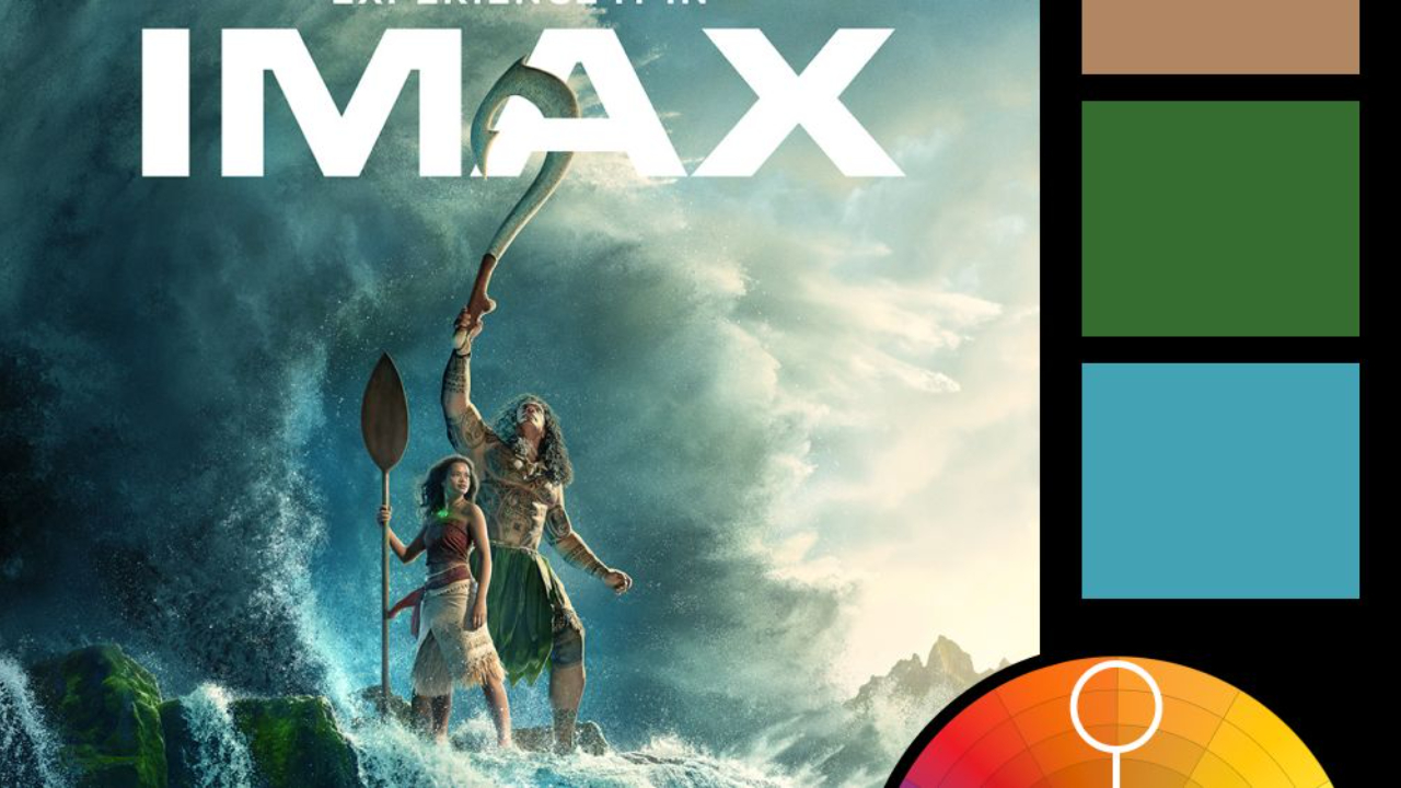
In this tutorial, we recreate the CRIME 101 movie-poster look in Photoshop using our own images. This is a solid exercise in layout discipline, color control, and subtle texture—where small, deliberate choices add up to a cinematic result.
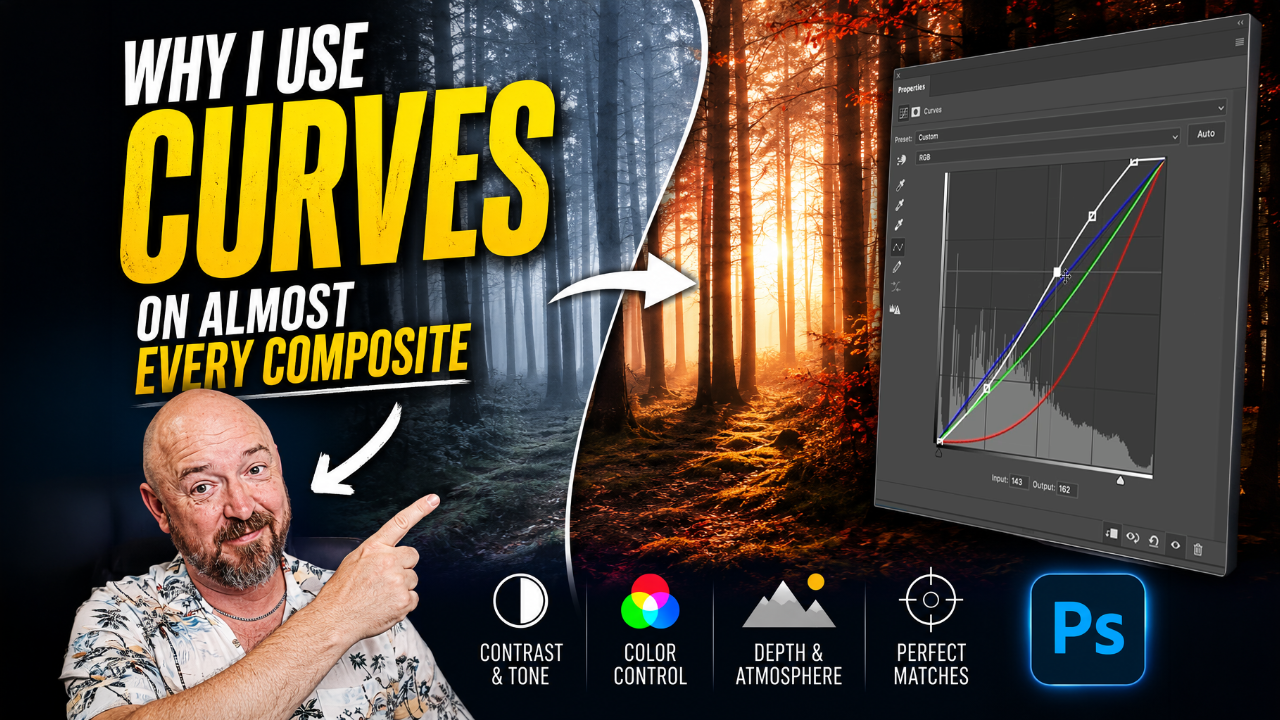
We start by building a proper theatrical canvas and grid system, then mask multiple images cleanly into the layout. From there, we use curves and a targeted gradient map to unify contrast and color across the entire poster. The final steps focus on separation lines, typography, and film grain to tie everything together.
Key Setup Details
-
Canvas: 2026 × 3000 px
-
Grid: 5 columns × 8 rows
-
Margins: 100 px (top/bottom), 82 px (left/right)
-
Horizontal guide: 2310 px
Color & Texture Settings
-
Gradient Map
-
Shadows:
#2f0e17 -
Highlights:
#e03210
-
-
Separation lines: 17 px solid black
-
Film Grain (Camera Raw)
-
Amount: 56
-
Size: 36
-
Roughness: 21
-
Blend mode: Linear Light at 20%
-
This workflow isn’t about copying a poster pixel-for-pixel. It’s about understanding how structure, color, and texture work together so you can apply the same approach to your own posters, thumbnails, or key art.
Watch the full video to see the complete process step by step.
You can download all the assets for this tutorial here:
Note: If you are not yet a member of Nucly, you can access the downloads here.