Classic color, sinister twist
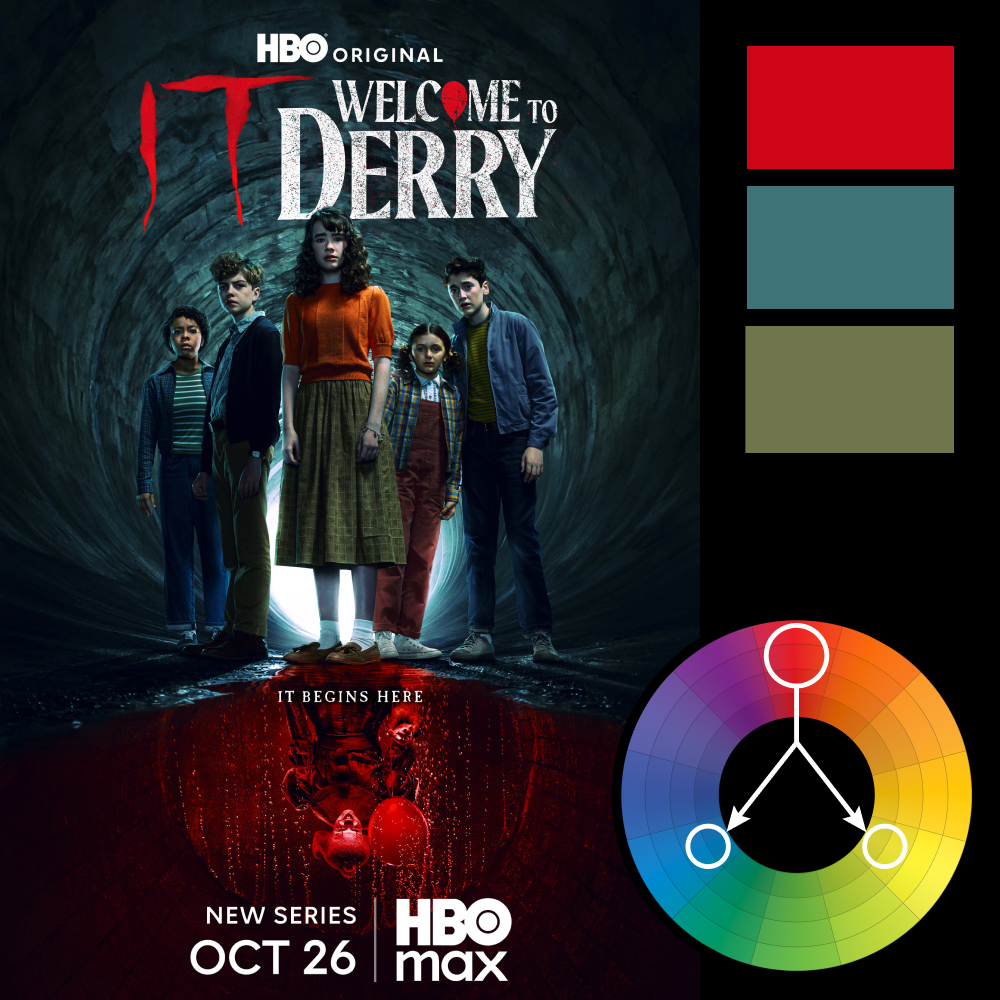
Artwork: Character poster for Welcome to Derry (HBO)
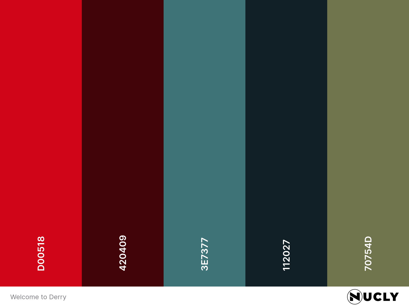
Color Harmony: Triadic
Key Color: Red
Link to Palette: Colors on coolors.co
As we near Halloween, it feels right to step into something unsettling—like the newest chapter (or rather, prequel) in the IT universe. The poster for Welcome to Derry uses a classic triadic color harmony, but it’s applied with restraint and intention.
Rather than three bold primaries, the hues are carefully desaturated to reflect the show’s eerie tone. The red—the signature of Pennywise—is saturated and sinister. The blue sits in the shadows of the sewer tunnel, grounding the characters in a cool gloom. And the yellow is turned muddy and vintage, used subtly in wardrobe and lighting to convey the 1960s period and add to the unease.
It’s a perfect example of how a bright and balanced harmony can be twisted just enough to feel off—exactly what horror should do.