A Tactical Balance of Triadic Colors

Artwork: Rainbow Six Concept Art by Daniel Bayona
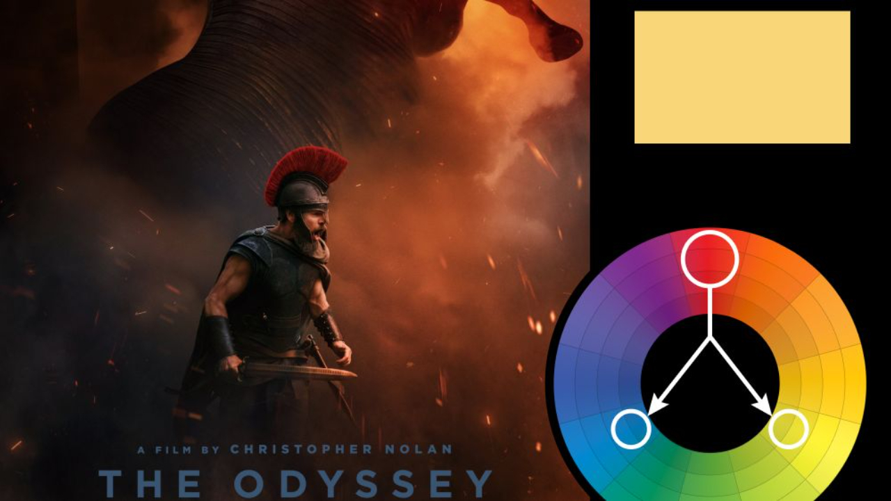
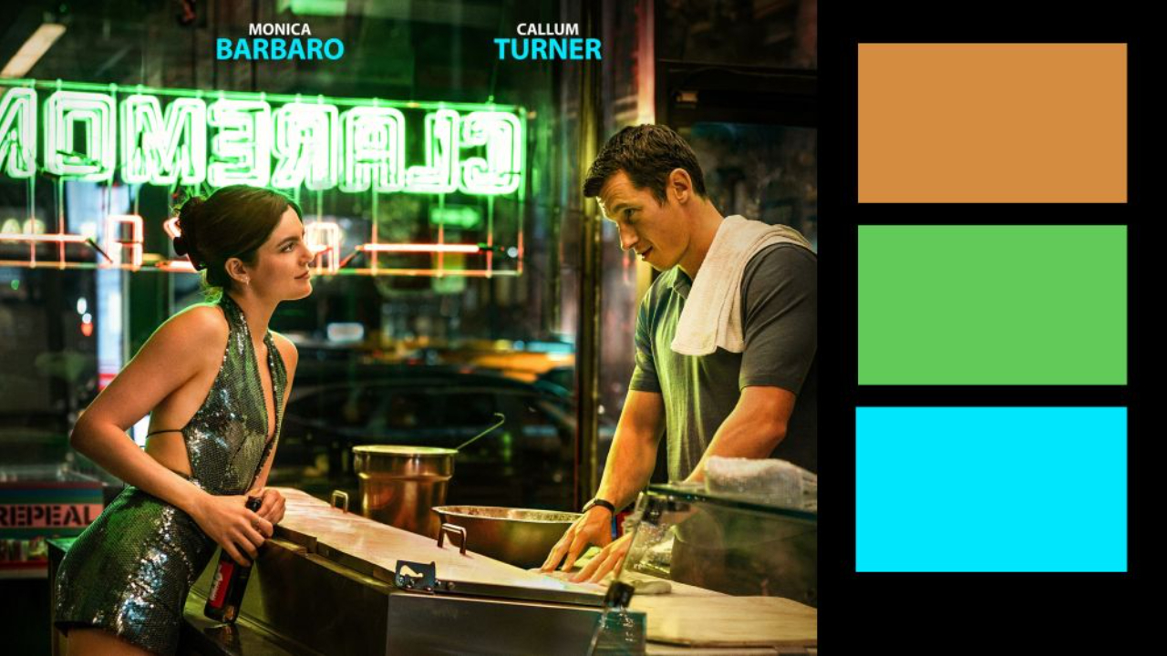
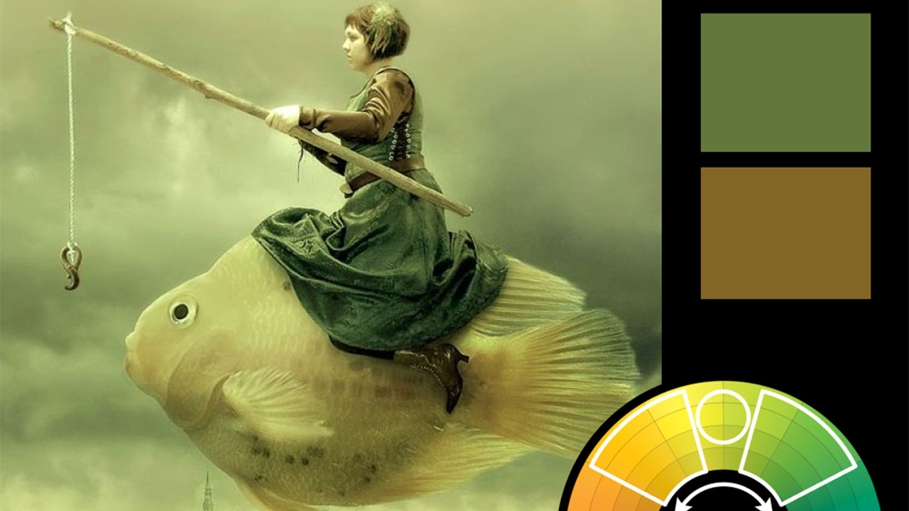
Color Harmony: Triadic
Key Color: Blue
Link to Palette: Colors on coloors.co
This week’s featured concept art is from Daniel Bayona’s work for Rainbow Six, showcasing a dynamic triadic color harmony. Blue serves as the key color, dominating the scene with its cool tones that emphasize the industrial and high-tech setting. Yellow and red accents are strategically placed, adding energy and guiding the viewer’s eye through the composition.
The balance of these three colors creates a sense of controlled chaos—perfect for a high-stakes, tactical environment. The pops of red suggest urgency and danger, while the yellow tones highlight key areas of action. This triadic harmony not only enhances the mood but also helps build a story within the frame, capturing both the tension and complexity of the scene.


