A poster that whispers—then lingers
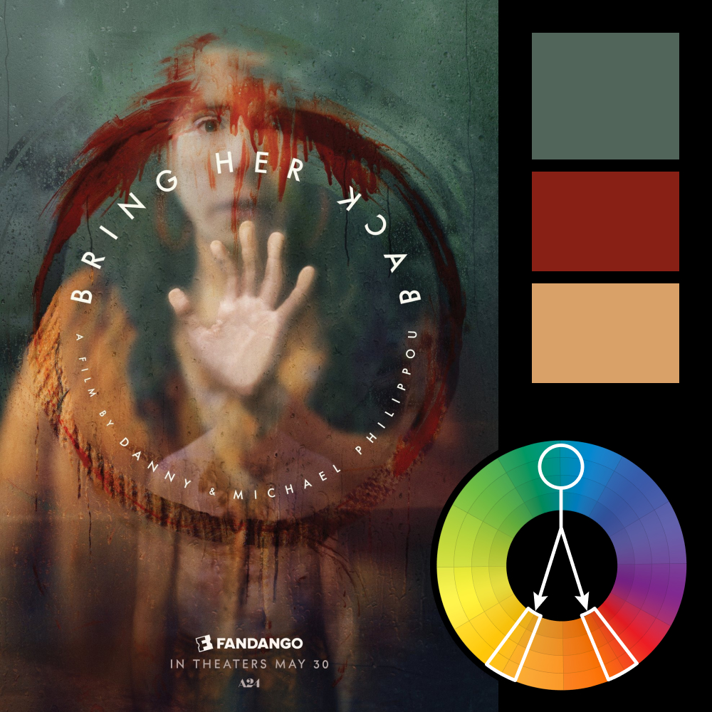
Artwork: Bring Her Back Movie Poster by Empire Design
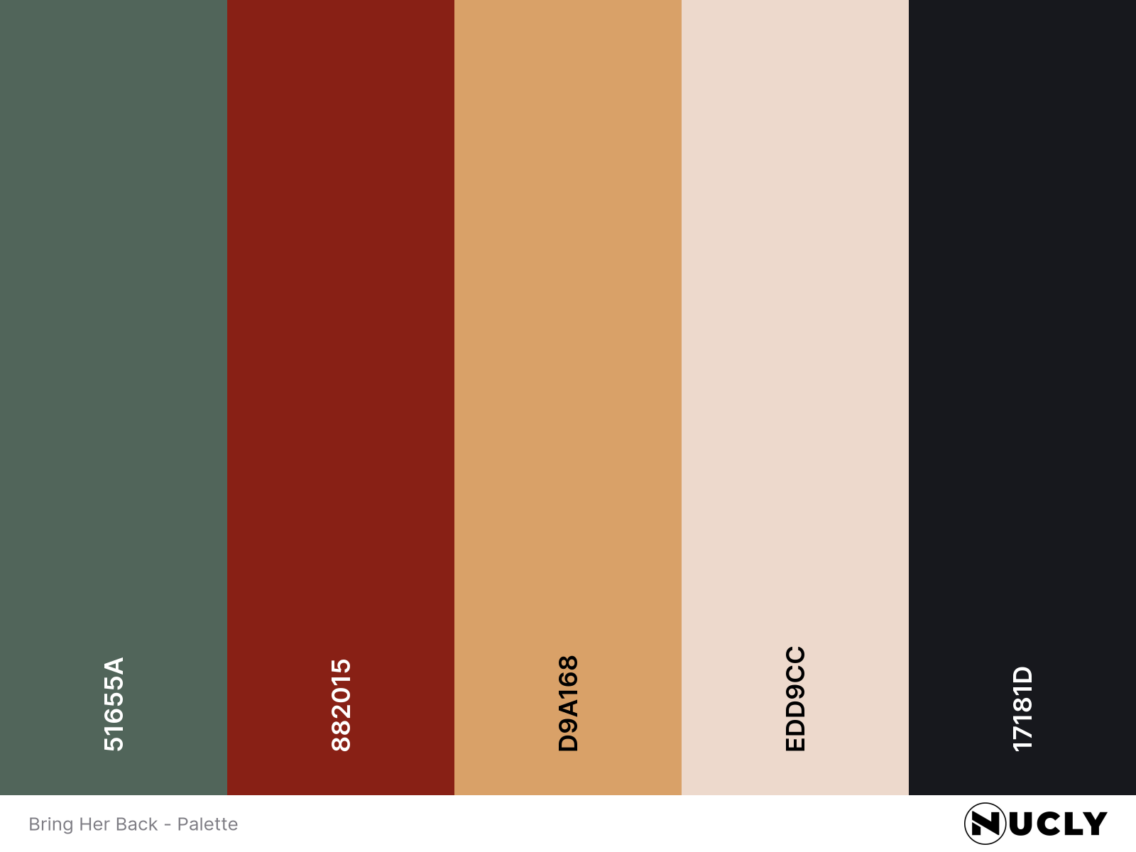
Color Harmony: Split Complementary
Key Color: Desaturated Teal
Link to Palette: Colors on coolors.co
This week’s feature is a hauntingly elegant poster for Bring Her Back. The harmony is built on a split complementary scheme, with desaturated teal dominating the background while red and warm yellow are used sparingly—but effectively—for contrast and emphasis.
What really stands out is how restrained the design is. There’s a quiet tension created by the minimal palette, made more impactful by the clever use of type. The curved text doesn’t just sit on the poster—it wraps around the subject, becoming part of the visual story. It’s a reminder that sometimes the most powerful compositions are the ones that leave room for silence.